demnogis
Regular Member
imported post
That argument has been used in the courts before, and been ignored.
That argument has been used in the courts before, and been ignored.
In this age of computers and internet, starting an maintaining a corporation is getting easier and more manageable. There are some costs of course, and that can present barriers or obstacles, but I believe they can be overcome for initial organizing. Keeping people interested and active once the corp is formed is a problem thatI've seen surface. So a key ingredient is to act in a responsible manner in operating the corp, and be very inclusive ofyour support group. And don't expect immediate profits from a newly formed org. It's like growing a child or business.CA_Libertarian wrote:I voted no; not that I think a logo is a bad idea, but because we would be putting the cart before the horse.
What we really need is to form a state-wide organization. This is something I've really wanted to get going for a couple years now (back when there was like 10 of us total on this state's sub-forum). I think now we might be getting enough people where it's a good time to do it.
Once we have a board of directors, a stated purpose/mission, etc... then we should start worrying about the details.
THIS^^^^
I voted no as well.
I guess a simple square sticker with this message "2A OK" should be okay. No guns, no nothing. Will raise interests for those who dont know it, and won't be "hostile" to those who are antis. They probably wont notice it even. They will just be surprised to see a fellow near them with a holstered firearm.It would also be nice to have some kind of decal that businesses could put on their doors to signify that OC is OK. Perhaps, just a square with:
OC
OK
They would be signifying that they allow/support OC without the "stigma" of having something that has a picture of a firearm on it.
Thoughts?
A well designed logo would easily work in any format...tshirts, stickers, brochures, business cards, banners, public busses, bus stops, billboards, bus stops, tats, hair shavings...lingerie...:lol:I would like to see some of those European style oval stickers (that say UK, FR, IT, DE, etc for each country) but with OC and 2A in them. I'd put one on each corner of my back window. I drive a Volvo so it would look appropriate anyway.
I have a little experience in logo development. A couple of thoughts to keep in mind...
1. The logo needs to be eye-catching and at the same time universally understood. Logos that need explaining are only good for some unique types of business, not the general public.
2.A well designed logo will "work" in full color, single color, and black and white. Sometimes minor modifications are appropriate to do so, but the logo itself doesn't change. So a good logo is actually a collection of versions off of the full color logo.
3. Any text integral to the logo must be legible at any font size for the intended purpose. For example, on a booth signthe logo should be legible anywhere from 20-50 ft away perhaps more, while a printed document or brochure (letterhead and the like) should be legible from 3-10 ft away. A logo you can't read is a worthless logo. Because of this a lot of logos forego text all together.
I suggest a friendly logo competition. Everyone with a creative hand submit your logo for judging. May the best logo win. How about designs being due in 1-2 weeks.
I agree. And I would also mention it is not just a case of putting the cart before the horse. In fact, we don't have a cart, yet. Heck, we don't even have a horse! First things first.. . . we would be putting the cart before the horse.
")

Vectors.coolusername2007 wrote:I have a little experience in logo development. A couple of thoughts to keep in mind...
1. The logo needs to be eye-catching and at the same time universally understood. Logos that need explaining are only good for some unique types of business, not the general public.
2. A well designed logo will "work" in full color, single color, and black and white. Sometimes minor modifications are appropriate to do so, but the logo itself doesn't change. So a good logo is actually a collection of versions off of the full color logo.
3. Any text integral to the logo must be legible at any font size for the intended purpose. For example, on a booth sign the logo should be legible anywhere from 20-50 ft away perhaps more, while a printed document or brochure (letterhead and the like) should be legible from 3-10 ft away. A logo you can't read is a worthless logo. Because of this a lot of logos forego text all together.
I suggest a friendly logo competition. Everyone with a creative hand submit your logo for judging. May the best logo win. How about designs being due in 1-2 weeks.
OK. It seems that there is some interest. I hear what some have said about getting the cart before the horse, but I'm not seeing this exercise as something that will clog up the gears of formally organizing when that day comes.
For now, let's see what type of logos we can come up with, like Streetbiker's. Keep in mind the points Coolusername has outlined.
We'll close the submittals in 2 weeks. No prizes for the winner, other than a hearty "congratulations!"
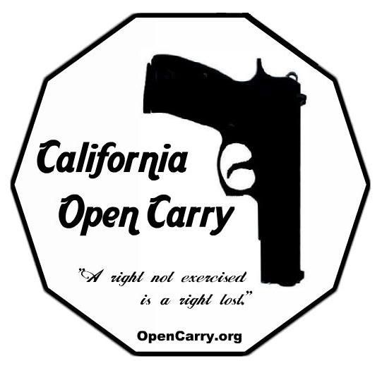
I will submit the following one.
That's so a decahedron, but to be fair, I thought it was an octagon at first and had the same thought about stop signs.I would avoid an octagon rim. This is used for stop signs, and you don't
want to be associating with stop carry.
Go for the school zone shape if any.:what:

Typical.
If they don't want to see it, they won't.
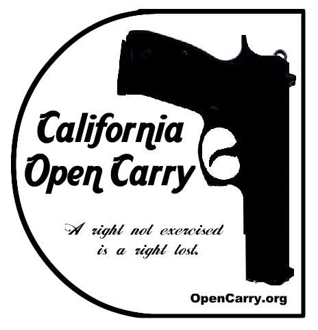
Well I like em' simple Here is one of my suggestions.
That's pretty clever.It can not be too detailed. Look at any recognizable logo and you will notice every single one looks like it took 20 seconds to draw up. No matter what anyone says, simplicity is key.
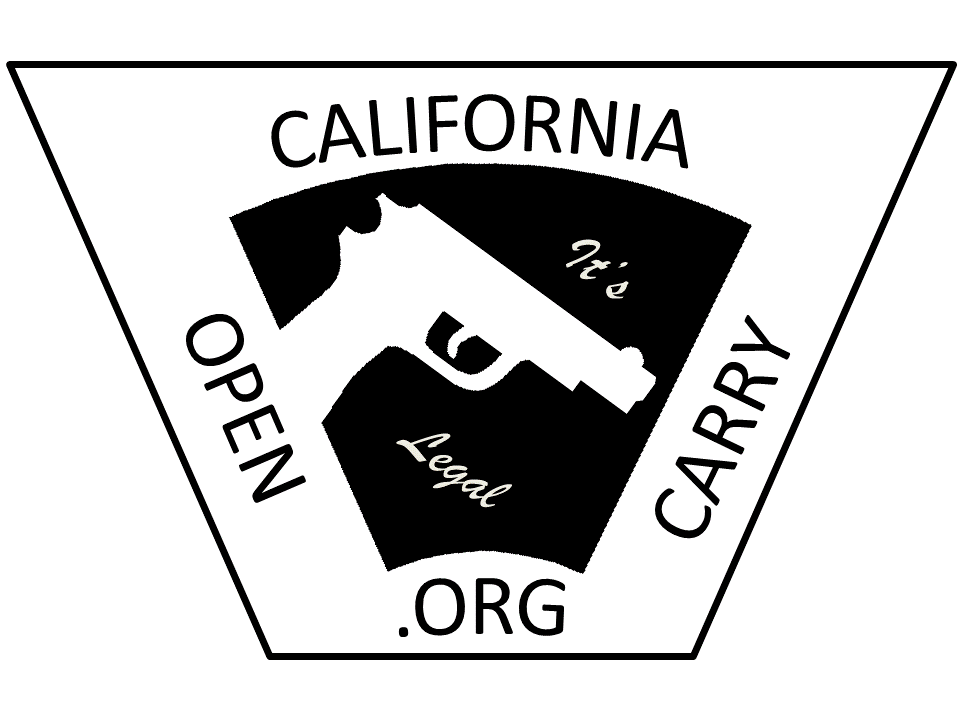
Here is a little idea I just cut up. You may be able to add a smile or a face with a toothpick in his mouth or something in the picture. Or add a better looking cowboy hat. Or no cowboy hat at all. Just an idea..
Edit: Or maybe add asmaller California with a womans hat and then 2 very small californias with two baseball caps showinghes protecting his family
