• We are now running on a new, and hopefully much-improved, server. In addition we are also on new forum software. Any move entails a lot of technical details and I suspect we will encounter a few issues as the new server goes live. Please be patient with us. It will be worth it! :) Please help by posting all issues here.
  • The forum will be down for about an hour this weekend for maintenance. I apologize for the inconvenience.
  • If you are having trouble seeing the forum then you may need to clear your browser's DNS cache. Click here for instructions on how to do that
  • Please review the Forum Rules frequently as we are constantly trying to improve the forum for our members and visitors.

California Logo Run-off

Which logo do you like best?

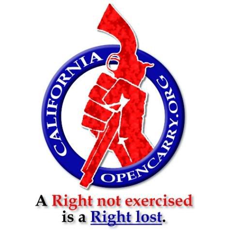
  • Logo A

    Votes: 0 0.0%
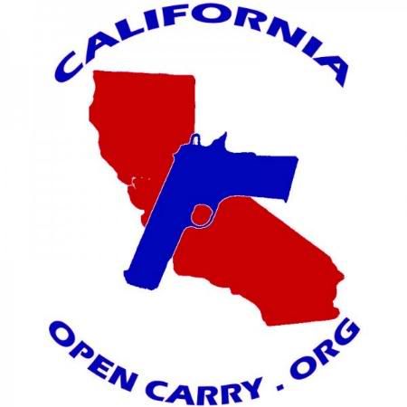
  • Logo B

    Votes: 0 0.0%

  • Total voters
    0

Streetbikerr6

Regular Member
Joined
Feb 2, 2009
Messages
389
Location
Folsom, , USA
imported post

MudCamper wrote:
Streetbikerr6 wrote:
MudCamper wrote:
I vote no on both. If anyone wants a shirt with a logo on it, go to cafepress.com and make one for yourself. I do it all the time.
Thanks for the constructive criticism. Wait, you left none.Why don't either appeal to you?
I just don't like them. Sorry. Just my opinion, and you know what they say about opinions...

And we are not a membership organization. We don't have dues. We don't have a platform or set of plans or goals that we all agree on. What is the purpose of this logo? Just to put on a t-shirt? OK. I did offer some constructive criticism about that: If you like a particular logo, or your own logo for that matter, go to cafepress and make yourself a t-shrit. What's not constructive about that suggestion?

Let me try to articulate how I feel about this a little more. If you want your own symbol, that's fine. But it feels like there is an effort to create one single symbol that somebody (who I don't know) is then going to say, "This symbol represents all of us. Use no other symbols." I don't want representation. I may not agree with your symbol or your ideas. I'm finding it difficult to articulate well, but I just know i don't like this whole logo thing.
Well I believe this is our platform. We all represent the same goals: keep open carry rights alive while spreading the education and facts about defensive carrying of a firearm. People in America have this myth in their head that someone with a gun is either A. a cop or B. a criminal. They left out C. a law abiding citizen protecting himself and others against criminals who know a cop can't always be around, and either can not obtain a concealed weapons permit or believe open carrying is more effective. I'm not saying this logo we choose in this forum will be the particular one if we ever do incorporate into an official organization. Although I think this logo is important to show we came from somewhere, generaly speaking- this forum. We all heard about the man carrying at the obama event, he is NOWHERE to be found, not on this forum at all. Now, if he wore a logo, that is widespread recognition for this forum and for America to come and learn the facts.
 

MudCamper

Founder's Club Member
Joined
Sep 17, 2007
Messages
709
Location
Sebastopol, California, USA
imported post

I guess I equate logos with organizations, but not with movements. We are participating in the Open Carry Movement. But I do see your point as to the value of a logo, to help make it easier for the lay person (and LEO).
 

Streetbikerr6

Regular Member
Joined
Feb 2, 2009
Messages
389
Location
Folsom, , USA
imported post

MudCamper wrote:
I guess I equate logos with organizations, but not with movements. We are participating in the Open Carry Movement. But I do see your point as to the value of a logo, to help make it easier for the lay person (and LEO).
Personally, I wan't a logo to show this liberal ass town of mine that there are gun owners around, and we are proud. Though I'm not going to put an NRA sticker on my truck, sort of a cliche.
 

hammerhands32

Regular Member
Joined
Mar 11, 2009
Messages
19
Location
Orangevale, California, USA
imported post

"A" is kind of in your face while "B" is a little more laid back.

I chose "A" because I'm tired of my rights being trampled and I view it as my own "I dare you to say something about it" logo.

Not very mature I know but I'm sure there are more out there like me.
 

HankT

State Researcher
Joined
Feb 20, 2007
Messages
6,215
Location
Invisible Mode
imported post

Sons of Liberty wrote:
A:

07.jpg


A above has an angry mood to it. I really like the fist, which reminds me of the old Hunter Thompson Gonzo symbol. And using a revolver is nice, albeitmostly because I like revolvers. But a hand holding a revolver in that way is kind of odd. It could actually be a graphic for a gun-grabber kind of concept.

I do like the offset of the wording in the circle border. And the catch phrase nicely communicates a bedrock pro-OC principle.


Sons of Liberty wrote:

B above is kind of bland. The gun profile overlaid onto the Cali map is kind of mysterious. I want to make a symbolic or graphical connection but it's, well, indistinctly related. The gun is simplyploppedontothe map. Why no catch phrase on this one?


Overall, for a broad audience, the logos are not exciting or particularly illuminating. Hmm, I think it's because of the gun. They both seem to reflect the need to make a depiction of a gun very prominent. Yep, that's it.

Why have a gun in the logo, anyway? I can't think of any really good reason.

My recommendation would be to design some logos without the gun.

Another thing, actually the first thing, is: what is the message that is intended to be communicated by the logo? That's really where one should start...

If you're trying to communicate what a gun is, by all means, put a gun graphic in the logo. If you're trying to communicate a complex ofideas such as gun rights, constitutionality, public OC and self-defense, then a gun form arguably is not up to the task...
 

Chrisc411

Regular Member
Joined
Sep 8, 2009
Messages
137
Location
Lemon Grove, Ca.
imported post

HankT wrote:
Sons of Liberty wrote:


A above has an angry mood to it. I really like the fist, which reminds me of the old Hunter Thompson Gonzo symbol. And using a revolver is nice, albeitmostly because I like revolvers. But a hand holding a revolver in that way is kind of odd. It could actually be a graphic for a gun-grabber kind of concept.

I do like the offset of the wording in the circle border. And the catch phrase nicely communicates a bedrock pro-OC principle.


Sons of Liberty wrote:

B above is kind of bland. The gun profile overlaid onto the Cali map is kind of mysterious. I want to make a symbolic or graphical connection but it's, well, indistinctly related. The gun is simplyploppedontothe map. Why no catch phrase on this one?


Overall, for a broad audience, the logos are not exciting or particularly illuminating. Hmm, I think it's because of the gun. They both seem to reflect the need to make a depiction of a gun very prominent. Yep, that's it.

Why have a gun in the logo, anyway? I can't think of any really good reason.

My recommendation would be to design some logos without the gun.

Another thing, actually the first thing, is: what is the message that is intended to be communicated by the logo? That's really where one should start...

If you're trying to communicate what a gun is, by all means, put a gun graphic in the logo. If you're trying to communicate a complex ofideas such as gun rights, constitutionality, public OC and self-defense, then a gun form arguably is not up to the task...


Well i see it in the first one it reminds me that i don't wanna say fight but to hold onto or to keep their firearm if the gun was held correctly then i'd construed it as anger or force somehow but its being held in a passive.

The second one i honestly agree with sons of liberty on this that it is kinda bland and the symbol don't really do anything to someone looking at it not to understand it, from an outside perspective would possibly be "ok guns in california?"

I'm just saying this is my point of view of the 2 logos
 

Streetbikerr6

Regular Member
Joined
Feb 2, 2009
Messages
389
Location
Folsom, , USA
imported post

Chrisc411 wrote:
HankT wrote:
Sons of Liberty wrote:


A above has an angry mood to it. I really like the fist, which reminds me of the old Hunter Thompson Gonzo symbol. And using a revolver is nice, albeitmostly because I like revolvers. But a hand holding a revolver in that way is kind of odd. It could actually be a graphic for a gun-grabber kind of concept.

I do like the offset of the wording in the circle border. And the catch phrase nicely communicates a bedrock pro-OC principle.


Sons of Liberty wrote:

B above is kind of bland. The gun profile overlaid onto the Cali map is kind of mysterious. I want to make a symbolic or graphical connection but it's, well, indistinctly related. The gun is simplyploppedontothe map. Why no catch phrase on this one?


Overall, for a broad audience, the logos are not exciting or particularly illuminating. Hmm, I think it's because of the gun. They both seem to reflect the need to make a depiction of a gun very prominent. Yep, that's it.

Why have a gun in the logo, anyway? I can't think of any really good reason.

My recommendation would be to design some logos without the gun.

Another thing, actually the first thing, is: what is the message that is intended to be communicated by the logo? That's really where one should start...

If you're trying to communicate what a gun is, by all means, put a gun graphic in the logo. If you're trying to communicate a complex ofideas such as gun rights, constitutionality, public OC and self-defense, then a gun form arguably is not up to the task...


Well i see it in the first one it reminds me that i don't wanna say fight but to hold onto or to keep their firearm if the gun was held correctly then i'd construed it as anger or force somehow but its being held in a passive.

The second one i honestly agree with sons of liberty on this that it is kinda bland and the symbol don't really do anything to someone looking at it not to understand it, from an outside perspective would possibly be "ok guns in california?"

I'm just saying this is my point of view of the 2 logos
I like what sons of liberty is on too. Maybe a logo such as a shield with a giant "2" on it representing the second amendment right to defending oneself? hmm. How bout this.. the logo, then one of the slogans underneath, I rather like the last one, since who doesn't want violent crime to stop? Very good attention grabber/ good cause statement for the logo. straight to the point don't you think?

[align=center]California open carry
*logo*
American's against defenseless victims
or
American's against violent crime
or
Violent Crime Stops Now
[/align]
 

demnogis

Regular Member
Joined
Jul 21, 2008
Messages
911
Location
Orange County, California, USA
imported post

When making logo A, I put a lot of thought into it. Anyone who follows the court system, legislature and gubernatorial action realizes that here in CA, it is a fight for our right. We're going beyond assertion now.


If these end up being a tie (again), maybe we can both come up with something stylish and "non-hostile" I suppose. Group-effort mayhaps?
 

CA_Libertarian

State Researcher
Joined
Jul 18, 2007
Messages
2,585
Location
Stanislaus County, California, USA
imported post

demnogis wrote:
When making logo A, I put a lot of thought into it. Anyone who follows the court system, legislature and gubernatorial action realizes that here in CA, it is a fight for our right.
I like it. I don't understand why anybody would percieve that as violent, unless they're afraid of guns or something... and those people are going to be offended by anything we put on the logo.
 

HankT

State Researcher
Joined
Feb 20, 2007
Messages
6,215
Location
Invisible Mode
imported post

CA_Libertarian wrote:
demnogis wrote:
When making logo A, I put a lot of thought into it. Anyone who follows the court system, legislature and gubernatorial action realizes that here in CA, it is a fight for our right.
I like it. I don't understand why anybody would percieve that as violent, unless they're afraid of guns or something... and those people are going to be offended by anything we put on the logo.

Really? You really cannot see why anybody might perceive the graphic as violent?

Except for only one reason, of course, that they would be afraid of guns?

You're kinda limited in your thinking, CAL.
 

CREWDAD

Regular Member
Joined
Oct 18, 2009
Messages
73
Location
San Marcos, California, USA
imported post

I also agree with Street, as I said before, the gripping of the gun could come off as an in your face type of thing. I would go with B and then try to incorporate the United States Flag and the California Flag into the picture of the state.
 

upioneer

New member
Joined
Jul 9, 2009
Messages
7
Location
SoCal, California, USA
imported post

not to be negative or knock someone else's work, but im not a big fan of either. i just found out about the logo "contest" today, if it isnt too late can i try to whip somethin up and submit?
 

dirtykoala

Regular Member
Joined
Jan 27, 2009
Messages
644
imported post

The logos aren't final drafts. They will be tweaked once the vote is over
 

Streetbikerr6

Regular Member
Joined
Feb 2, 2009
Messages
389
Location
Folsom, , USA
imported post

CA_Libertarian wrote:
demnogis wrote:
When making logo A, I put a lot of thought into it. Anyone who follows the court system, legislature and gubernatorial action realizes that here in CA, it is a fight for our right.
I like it. I don't understand why anybody would percieve that as violent, unless they're afraid of guns or something... and those people are going to be offended by anything we put on the logo.


Listen, we have to realize not everyone seeingthe logo is going to think "Hmm a guy holding a gun, I really care about this logo right now so I am going to spend hours researching what this logo is all about". Please, get over yourselves guys. No one cares about open carry. So the logo is our GLIMPSE OF REPRESENTATION to every normal citizen in the U.S. This logo is our 2 second advertisement. Because face it, no one cares enough to research it, just like I don't care enough to research the facts on how many people smoking kills when I see a cigarette ad. If you want to have a guy angrily holding a gun as our logo, be my guest, but remember, nobody cares enough to research this and seperate the facts to realize this is a "fight for our rights", as you truthfully put it. No one is ever going to respect our cause enough to respect that mindset. No one cares for your cause. You need to represent something EVERYONE cares about, such as protecting ones own life.

Alogo with some slogan a long the lines as "Violent Crime Stops Now", will have everybody looking and seeing, "Ok, I get it, something to do with stopping violent crime.. I like that.k back to my daily life now". Because once again, most do not care enough to research. With this slogan though, I gaurantee more people will want to see how to stop violent crime,rather than
help or respectyour 'stupid' cause/movement to hold onto a revolver upside down or 'keep your guns'.


Sorry to be harsh, but trying to make this point stick.
 

CREWDAD

Regular Member
Joined
Oct 18, 2009
Messages
73
Location
San Marcos, California, USA
imported post

Not sure where the "get over yourselves" comment comes from, I don't think anyone is making it about themselves! Its just about opinions on a freaking logo dude! Really... chill out. No one is going to make you wear it!
 

Streetbikerr6

Regular Member
Joined
Feb 2, 2009
Messages
389
Location
Folsom, , USA
imported post

CREWDAD wrote:
Not sure where the "get over yourselves" comment comes from, I don't think anyone is making it about themselves! Its just about opinions on a freaking logo dude! Really... chill out. No one is going to make you wear it!
Like I said, the harshness was for a reason. I agree in whole the logo means a fight for your rights, but if you re-read my entire post with an open mind, you will realize that nobody will look at that logo and care enough to look past the "old man holding onto his guns stereotype" to realize our cause here. What I am saying when I say "get over yourself" I am meaning, think from the other guy's perspective. Once again, harsh for a reason, we are on the same team here.

edit: by the way I'm pretty sure we voted for the same logo, you already understand my stance, I only heightened my post to get that point out to the other's who don't yet see it from everyone outside our forum. Please don't take offense to that.

let me try and rephrase this...
If this were a save the ducks forum, and we had a picture of a duck flying free, face it, nobody cares about the stupid ducks!! But if these ducks were somehow crime fighting ducks that saved lives, but Americans did not know this, I would tell this forum "get over yourselves, noone cares about the ducks, but they would care if they saved lives, so focus the logo on that aspect of the ducks". Sure many in this forum just want to save the ducks because they care about ducks, but to appease every other American, we focus the logo on what America cares about, saving lives.

Get it?
 
Top